Nateo Tutorial: Tooltips
There are two types of tooltips that are supported by the NtTimeChartControl: Regular tooltips and HTML tooltips. HTML tooltips are HTML pages rendered by a browser control.
This allows very complex and nicely rendered tooltips for the price of some additional memory and CPU consumption. The quality of display is worth the price, especially as creating good looking HTML tooltips
is extremly easy.
This example will cover both kinds of tooltips. For this reason we will create a NtTimeChartControl that has two rows each holding one data type. The one data type will have regular
tooltips while the other one will have HTML tooltips.
1. Preparing the application
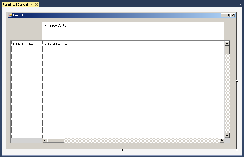
Create a Form with an empty NtTimeChartControl, a NtHeaderControl, a NtFlankControl to the left, a NtBackPanel
and the appropriate scrollbars like in the examples before. In the IDE this might look like this:
Then let your Form1_Load() member look like this:
private void Form1_Load(object sender, EventArgs e)
{
ntTimeChartControl.SetNtApplication(this);
ntTimeChartControl.Init(10 * 24, 90, TimeDisplayMode.hours);
ntTimeChartControl.SetScrollBars(ntTimeChartControlHScrollBar, ntTimeChartControlVScrollBar);
ntHeaderControl.Init(ntTimeChartControl, Font, Font, false);
ntLeftFlankControl.Init(ntTimeChartControl, null, ntLeftFlankControl.ClientSize.Width);
ntBackPanel.SetPadding(2, 2, 2, 2);
ntBackPanel.Repos(ntLeftFlankControl, ntTimeChartControl, ntTimeChartControlHScrollBar, ntTimeChartControlVScrollBar);
ntTimeChartControl.ScrollToDt(DateTime.Now, ntTimeChartControl.ClientSize.Width / 2, 0);
ntTimeChartControl.Focus();
//Create the NtDisplay Defs
NtDisplayDef ntDisplayDef = new NtDisplayDef();
ntDisplayDef.dataTypeId = 100;
ntDisplayDef.displayMethod = 1; //Text
ntDisplayDef.preferredRowHeight = 25;
ntDisplayDef.textBrush = Brushes.Black;
ntDisplayDef.foregroundBrush = Brushes.LightCoral;
ntDisplayDef.tooltipType = 1; //important: Here we set the tooltip type for data type 100
ntTimeChartControl.SetDisplayDef(ntDisplayDef);
ntDisplayDef = new NtDisplayDef();
ntDisplayDef.dataTypeId = 110;
ntDisplayDef.displayMethod = 1; //Text
ntDisplayDef.preferredRowHeight = 25;
ntDisplayDef.textBrush = Brushes.White;
ntDisplayDef.foregroundBrush = Brushes.LightSkyBlue;
ntDisplayDef.tooltipType = 2; //important: Here we set the tooltip type for data type 110
ntTimeChartControl.SetDisplayDef(ntDisplayDef);
//Create the Row Headers
Graphics g = CreateGraphics();
NtRowHeader rh = new NtRowHeader();
rh.InitRowHeaderText("Regular Tooltips", Font, Brushes.Black, Brushes.LightCoral, g);
ntTimeChartControl.SetRowHeader(100, rh);
rh = new NtRowHeader();
rh.InitRowHeaderText("HTML Tooltips", Font, Brushes.White, Brushes.LightSkyBlue, g);
ntTimeChartControl.SetRowHeader(110, rh);
g.Dispose();
//Create the Perspective
NtPerspective perspective = new NtPerspective();
NtRowPerspective rp = new NtRowPerspective() { rowHeight = 25 };
rp.dataTypeIds.Add(100);
perspective.rowPerspecives.Add(rp);
rp = new NtRowPerspective() { rowHeight = 25 };
rp.dataTypeIds.Add(110);
perspective.rowPerspecives.Add(rp);
ntTimeChartControl.SetNtPerspective(perspective);
//Insert Data Objects
DateTime now = DateTime.Now.ToUniversalTime();
NtDataObject ntdo1 = new NtDataObject() { objId = 1, dataTypeId = 100, dt = now, dtEnd = now, dataItem = "This object has a regular tooltip" };
ntTimeChartControl.InsertDataObject(ntdo1);
NtDataObject ntdo2 = new NtDataObject() { objId = 2, dataTypeId = 110, dt = now, dtEnd = now, dataItem = "This object has a HTML tooltip" };
ntTimeChartControl.InsertDataObject(ntdo2);
}
2. Implement the interface NtApplication
Please add the NtApplication referece to the header of your Form:
public partial class Form1 : Form, NtApplication
{
...
}
Then add the implementing methods to your form class:
public bool NtIsHoliday(DateTime dt) { return false; }
public bool NtIsWeekend(DateTime dt) { return false; }
public string NtGetText(NtDataObject ntDo) { return (string)ntDo.dataItem; }
public double NtGetDouble(NtDataObject ntDo) { return 0; }
public Bitmap NtGetIcon(NtDataObject ntDo) { return null; }
public Bitmap NtGetBitmap(NtDataObject ntDo) { return null; }
public string NtGetTooltipText(NtDisplayObject tooltipDisplayObject, int ttType)
{
StringBuilder sb = new StringBuilder();
if(ttType==1)
{
sb.Append("This is a regular tooltip");
sb.Append("\nDate:\t" + tooltipDisplayObject.DataObject.dt);
sb.Append("\nEnd:\t" + tooltipDisplayObject.DataObject.dtEnd);
sb.Append("\nValue:\t" + tooltipDisplayObject.DataObject.dataItem);
}
if (ttType==2)
{
sb.Append("\n <!DOCTYPE html PUBLIC \"-//W3C//DTD XHTML 1.0 Transitional//EN\" \"http://www.w3.org/TR/xhtml1/DTD/xhtml1-transitional.dtd\">");
sb.Append("\n <html xmlns=\"http://www.w3.org/1999/xhtml\">");
sb.Append("\n <head/>");
sb.Append("\n <body style=\"padding:0px; margin:0px; background-color: #D8D8DC;\">");
sb.Append("\n <div style=\"border:4px solid #A0A0C0;width:360px;\">");
sb.Append("\n <h1 style=\"color:#800000;text-align:center;\"><u>HTML-Tooltip</u></h1><br>");
sb.Append("\n <table cellspacing=\"0\" style=\"border-collapse: collapse;margin:40px;\">");
sb.Append("\n <tr><td>Date:</td><td>" + tooltipDisplayObject.DataObject.dt + "</td></tr>");
sb.Append("\n <tr><td>End:</td><td>" + tooltipDisplayObject.DataObject.dtEnd + "</td></tr>");
sb.Append("\n <tr><td>Value:</td><td>" + tooltipDisplayObject.DataObject.dataItem + "</td></tr>");
sb.Append("\n </table>");
sb.Append("\n ");
sb.Append("\n </div>");
sb.Append("\n </body>");
sb.Append("\n </html>");
}
return sb.ToString();
}
To actually use this interface, you already added the following line of code to your Form1_Load() member method:
ntTimeChartControl.SetNtApplication(this);
Tip on HTML Tooltips
Please take a look on the example code above that makes up the HTML string. You will find a <div> tag there that has a style attribute. In that you will find 'width:360px;'. This is important because the
HTML rendering engine has to determine the preferred width of the HTML page. And as HTML pages can be rendered in various widths, there is no default width for HTML tooltips. Please remove this width style and
give it a try, you will see the difference. So when setting up HTML tooltips a layout like the one described above makes sense in order to control the width.
Results
Please launch the application and check the two different tooltips. The HTML tooltip should look like this:
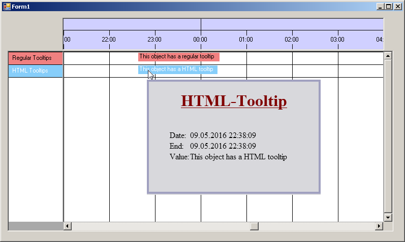
Of course in a more professional application you will fill the tooltip with reasonable content. E.g. you use color coding and icons to symbolize certain states and you will create small tables with additional
information.
Back to Overview