
Nateo Concept: Condensed View
Long Time Range Overview
When zooming out the time scale to an overview over several months or even longer, data objects overlay too much to see any detail or even understand where data groups. The condensed view is
a special display mode for better overviews.
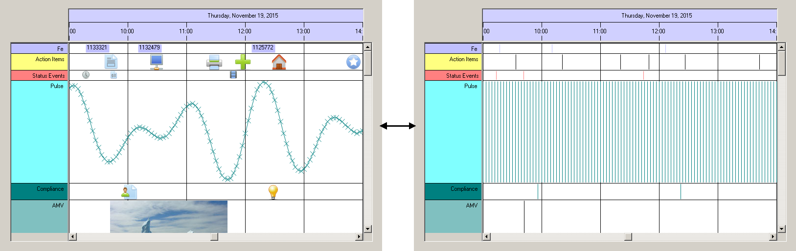
For better understanding first look onto a screen shot of a small time range of only 5 hours in the image below. It shows the normal view on the left, where all data objects are drawn the regular way.
On the right you can see the condensed view: The data objects are represented by a thin vertical line located at the time stamp of the data object. The thin line covers almost the full row height. The
color of the line is the foreground color that is defined for this data type so it is somehow possible to distinguish different data types but there is no information about the value of any data object.
In fact the only information given in this view is when certain data objects take place.
Taking a look on the next image that shows a three month overview over the same data set, the difference gets visible: Instead of plastering the whole view with icons and symbols that overlap each others
massively, this view now shows how data is spread over time: Obviously there is a noticable aggregation of data in November while October and December hold less data.

This display mode surely is usable for rough overviews, only. But when scrolling through months and years, it might be the preferred choice of view because all data elements have the same width. This might be better
than scrolling over a full year and seeing one single data element represented by a bitmap that is as wide as two month, blocking the view on anything else arround.
The application can switch this so called 'Condensed View' on and off by a boolean flag. Anyway the
<< Prev.: Row Headers and Flank Controls Next: Bitmaps and Icons >>