
Nateo Concept: Row Headers and Flank Controls
Row Headers make up the Legend
In the
In order to let the user know, which data is shown in which row, you might want to label each of the rows accordingly. This is done by a row header which is attached to the left or right of a row.
A row header is defined by an object of type
Below please see an example of a
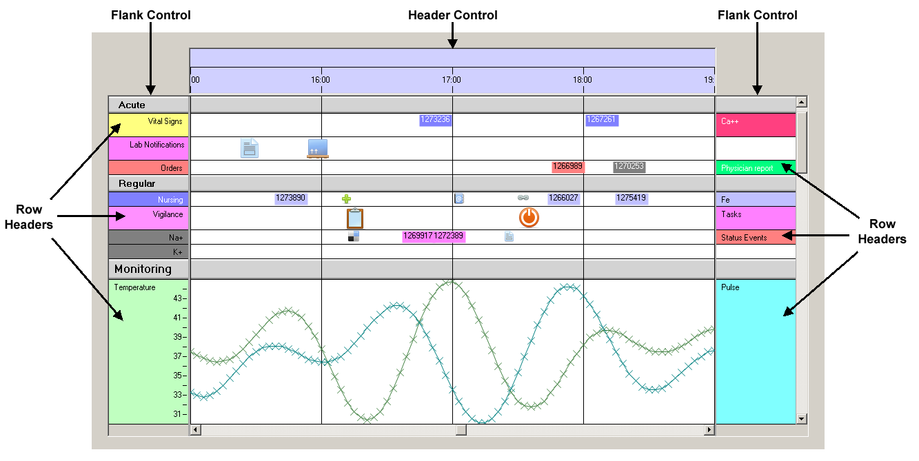
The Time Chart is located in the center and the Flank Controls are located to the left and right (that is why they are named 'Flank Controls').
The Flank Controls contain the Row Headers. On the left side there is one Row Header per row, while on the right there are some rows that have no Row Header. So some rows have one Row Header, others have two.
The reason is that in some rows there are two different data types shown while in others there is only one. For example the bottom row contains 'Temperature' and 'Pulse' in the same row, so you need two
Row Headers to let users know.
It is up to the programmer to assign as many Flank Controls to the Time Chart as wanted. A Time Chart can work with no Flank Control at all, but it can also have one, two or more of them. Of course in general it is
recommended to have at least one to let the data have a legend. And if you have more than one type of data in one row, you might want to have another legend like a graph that has one vertical axis on the left
and one on the right. Anyway it is no good style to have more than two Flank Controls.
How the Flank Controls work
In the image above you can see the vertical scroll bar on the very right. When users scroll vertically not only the Time Chart itself moves vertical but also the Flank Controls do so. As a consequence the
Row Headers stay always aligned with their data rows. In other words: Time Chart and all Flank Controls always scroll synchronously in vertical direction. Of course this only works if you locate the
FlankControls properly: They need to be aligned with the top of the Time Chart and must have the same height.
One important functionality of the Flank Controls is to allow vertical dragging of rows. Holding the Ctrl-Key and pressing the left mouse button, users can drag rows or even categories vertically within the
Flank Control and thereby change the order of rows or categories resp. It is needless to say that when changing the row order in one Flank Control the other follow instantly so the actions stays always consistent.
Finally you can drag the entire sheet in vertical direction by holding the left mouse button. This is a good technique if you want to drag the sheet vertically without moving it horizontally (what could happen
if you drag the sheet in the Time Chart).
Another thing is worth mentioning: The Flank Controls each have a sheet on their own, which is kind of a back panel the Row Headers a drawn upon. It is quite clear that the height of this sheet is the same as the
height of the Time Chart's sheet which again is the sum of all row heights. Meanwhile the width of a Flank Control's sheet is set during initialization. It can be bigger than the
It is needless to say that the better practice is not to have the Flank Control's sheet wider than the client area. The additional scroll bars and the cut off view are no good usability and should be left for
cases when they are really needed.
Row Headers
Row Headers are rectangular labels located inside the Flank Control aligned with the rows of the Time Chart. A Row Header is not specific for a row but for a data type that is in a row. If there are more than one data
types in one row then a Row Header belongs to only one of them. Please see the bottom row in the image above: The Row Header labeled 'Temperature' is for only one of the curves drawn in that row while the
Row Header labeld 'Pulse' is for the other one.
When initializing your
The actual assignment of Row Headers to Flank Controls and to the rows is finally done by the
So how to make a Row Header look right?
In the Nateo name space the Row Headers are made up by the class
First of all (as you can see in the image on top of this page) a Row Header has a background that is drawn by the
Next it has a
Finally the
So the drawing occurs like this: First the background is drawn using the
It is perfectly fine to change the text, bitmap, brush and position values at any time in order to dynamically change the Row Header. Please be sure to invalidate the appropriate area of the Flank Control to
initiate updating.
<< Prev.: Perspectives Next: Condensed View >>