
NtDisplayDef
The
The screenshot below shows a NtTimeChartControl that currently shows five different rows: One of type 'curve with cross marks', one 'text', one 'icons', one 'images',
and finally another one 'text':
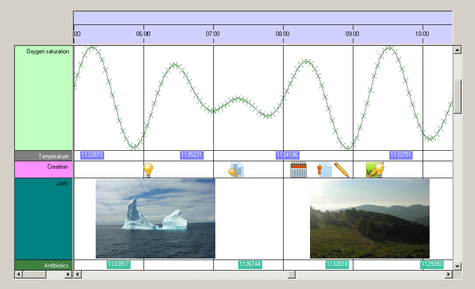
As you can see on Row Headers there are different color schemes for the different types of data. And most important: All data objects of the same type share the same row. For example all data objects of the
type 'Oxygen saturation' have the same
To summarize:
1. The
2. The NtPerspective defines which data type is shown in which row and what height (in pixels) the rows have.
About colors and brushes:
When setting up your
Anyway there are three different brushes and one pen used to define the appearance of data in the NtTimeChartControl:
bkBrush defines the background of the object. Interestingly objects should always be drawn without background. Instead the background brush is only defined for the application to know which brush is recommended by this object in order to fill the Row Headers or (if used) the background of the Time Chart.textBrush is used to draw texts.foregroundBrush is used to paint filled areas of the object. For example if an object is represented by a filled circle, this brush is best to use.foregroundPen is used for all drawing operations of data objects that need a pen (like lines).
The built in display types (text, curves, images and icons) can be served by these brushes and the pen. But what if you implement custom drawing to draw the objects of a certain data type by yourself and you need more
than one pen? The answer is easy: The
Example:
Looking at the image on the top of this page you will see the line 'Temperature' for example. Please note that in this row the data objects consist of blue rectangles decorated with white text.
The
For details on setting up all the members of
Class Hierarchy:

Constructors:
| Modifier | Name and Parameters | Description |
|---|---|---|
|
|
|
The default constructor. |
|
|
|
This constructor is the minimal initialization. Still more members should be set manually during initialization phase. The |
Members:
| Type | Name | Description |
|---|---|---|
| public int | dataTypeId |
One |
| public int | displayMethod |
The method how data is being drawn. There are four display types predefined: 0: None (object not displayed at all), 1: text, 2: curve with markers, 3: bitmap, 4: icon.
But creating your own display types is easy: Simply set |
| public int | preferredRowHeight |
In one and the same row of the NtTimeChartControl there can be more than one data type. For example you want to have a row in your application
that shows previews of PDF documents by bitmaps and indicators for customer orders by icons. So there are two data types (PDF documents and customer orders) that have different
sizes, as the icons are typically smaller. So the two different |
| public Brush |
|
The background brush for this data type. It is common technique to use this brush in order to initialize the NtRowHeader's |
| public Brush |
|
Whenever drawing an object means that areas (like rectangles) have to be filled, this is the appropriate brush to use. |
| public Pen |
|
Whenever drawing an object means that lines have to be drawn, this is the appropriate pen to use. |
| public Brush |
|
This brush is used to draw a data object's text. |
| public Font |
|
The Font used to draw the text of objects that are to show text. Can be null. |
| public StringFormat |
|
The StringFormat used to draw the text of objects that are to show text. This supports the setting of tab stops. Can be null. Whenever this member is not null it will be used to draw texts. |
| public int |
|
Maximum width of a drawn string in pixels. If a text is longer, it will be wrapped into a new line. |
| public string |
|
The title for naming the data type in the Row Header (which thereby makes up the legend for your data). |
| public int |
|
The width of the icons (if this data type is being displayed by icons). |
| public long | lineMaxSeconds | Data plots may consist of data points (data objects) that are linked by lines to form a curve. Linking two points by a line makes sense only if they are not too distant. This member defines the maximum distance in seconds that can be covered by a line. |
| public int | lineType | By default there are three options on how curves are being drawn within the NtTimeChartControl defined by lineType: 0: Only the objects are drawn, no line inbetween. 1: direct, possibly slope line inbetween objects. 2: objects connected by two segments: horizontal and vertical. |
| public int | hotspotX | The 'hot spot' of a visual representation of a data object like an icon is normally its top left edge. This means, that the visual representation (e.g. the icons) are aligned with their top edge to a certain Y-Coordinate (typically 2 pixels from top of the row) and with their left edge to the time stamp of the data object. Changing hotspotX moves the hot spot within the object to the right, which results in shifting the object's representation (e.g. icon) to the left. For icons that look like a crossmark e.g. it might be reasonable to move the hot spot to the middle. |
| public int | hotspotY | The 'hot spot' of a visual representation of a data object like an icon is normally its top left edge. This means, that the visual representation (e.g. the icons) are aligned with their top edge to a certain Y-Coordinate (typically 2 pixels from top of the row) and with their left edge to the time stamp of the data object. Changing hotspotY moves the hot spot within the object downwards, which results in shifting the object's representation (e.g. icon) upwards. For icons that look like a crossmark e.g. it might be reasonable to move the hot spot to the middle. |
| public int |
|
When drawing data items using bitmaps, this is the maximum height of the images. Images with bigger height are reduced (with the same factor in height and width) to fit this limit. This limitation
makes sense if you want to ensure that images always fit into the row. So a recommended value is Set this parameter to -1 to disable height limitation. This also is the default value. |
| public int |
|
When drawing data items using bitmaps, this is the maximum width of the images. Images with bigger width are reduced (with the same factor in height and width) to fit this limit. This limit is needed for internal calculations. You should make it as small as possible for performance reasons but still big enough to display all images uncompressed that you want to be shown uncompressed. |
| public int | tooltipType | The tooltip type. Possible values are 0: no tooltip, 1: simple tooltip (plain text with no formatting except new lines), 2: HTML based tooltip. |
| public double | scaleMin | Curves are based on numeric data. To scale the data within the height of the row you can define scaleMin and scaleMax. A value that is equal to scaleMin will then be placed exactly on the bottom of the row while one that is equal to scaleMax will be placed on the top. Values exeeding these limits are no problem but of course the display will be clipped. |
| public double | scaleMax | Curves are based on numeric data. To scale the data within the height of the row you can define scaleMin and scaleMax. A value that is equal to scaleMin will then be placed exactly on the bottom of the row while one that is equal to scaleMax will be placed on the top. Values exeeding these limits are no problem but of course the display will be clipped. |
See also: